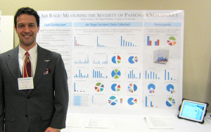
My research presentation was very popular this year. One has to be prepared for anything with an 8 AM audience, and I was pleasantly surprised by the number of people who expressed interest in my work.
This was my third appearance at the EMU Undergraduate Symposium. Drawing on experience from previous years, I created a poster that had a left column of major bullet points. On the middle half of the poster, I filled the area with 18 graphs summarizing the survey results. The right column summarized the survey participants’ demographic information and general answers about passenger misconduct.
I am invited to present my research again for the Dean of the College of Technology at an upcoming board meeting. This is an exciting opportunity to think about while working on the manuscript and, hopefully, publication.
Here are a few tips for future symposium presentations, based on what I’ve observed about designing an effective poster:
- People read from left to right.
- People often ask questions about the left half of a poster.
- People enjoy looking at details on the right half of a poster after I point out something in answer to a question.
- People will photograph their favorite posters.
- Very few people are interested in technical or procedural detail, whereas handouts are perfect for conveying niche information.
- People tend to ignore fonts smaller than 36 pt. I disagree with EMU’s suggestion to use 24 pt.
- Always remember the audience. At the EMU symposium, almost none of the audience is from the presenter’s department.
- People tend to ignore overly complex graphs and exotic data presentations. Use only bar, line, and sector graphs to present data.
- People spend more time reading bullet points than any other part of a poster. Use headings and sub-headings to help structure the text.